Techtober – Campaign Identity
Mountain America Credit Union
Mountain America Credit Union
Campaign Identity System, Digital Design, Internal Communications, Cross-Functional Rollout
Role: Creative Lead | Senior Visual Designer
Role: Creative Lead | Senior Visual Designer
Techtober was a cross-functional sales initiative designed to drive net-new checking growth and increase adoption of Mountain America's digital banking tools. The campaign required alignment across Sales, Marketing, and Training, spanning internal engagement, gamification, and external-facing touchpoints.
As the sole creative lead, I developed the campaign identity, defined the visual system, and guided execution across teams and channels.
As the sole creative lead, I developed the campaign identity, defined the visual system, and guided execution across teams and channels.
Context & Challenge
The initiative required building a cohesive campaign system within a complex and ambiguous environment:
• No dedicated creative direction or established campaign framework
• Conflicting priorities across Sales, Marketing, and Training
• Tight timelines with evolving stakeholder feedback
• Balancing enterprise brand standards with internal campaign flexibility
The challenge was not just to create a compelling visual direction, but to design a system that could scale across teams and channels while maintaining consistency.
Approach
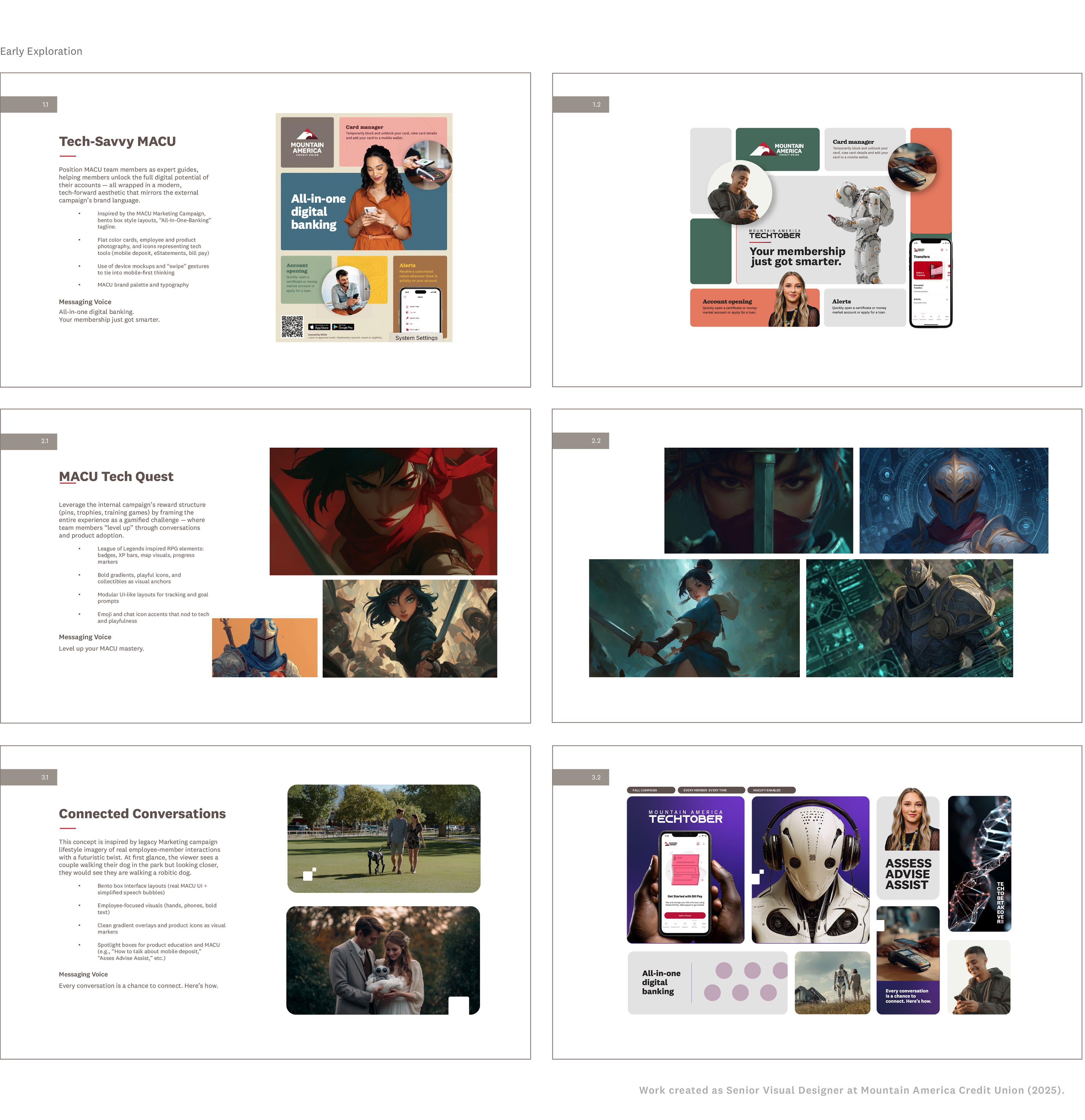
I explored three distinct creative directions to test tone, messaging, and system flexibility:
• Direction 1: A tech-forward, futuristic direction closely aligned with existing external campaign branding
• Direction 2: A multiplayer gaming-inspired concept built around competition and gamification
• Direction 3 (Selected): A hybrid system that offered enough digital energy to feel contemporary
while remaining approachable for a broad internal audience
while remaining approachable for a broad internal audience
Solution
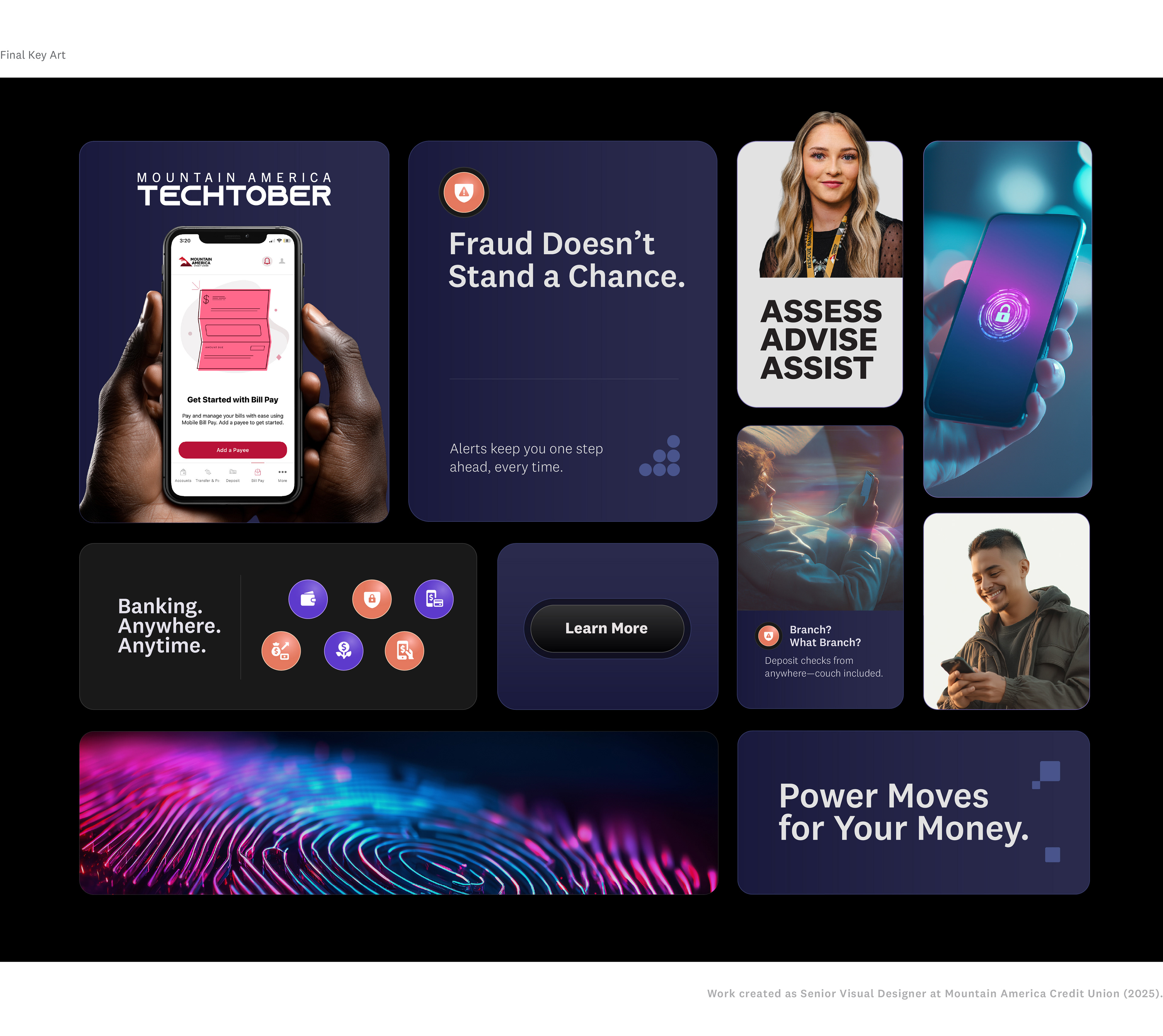
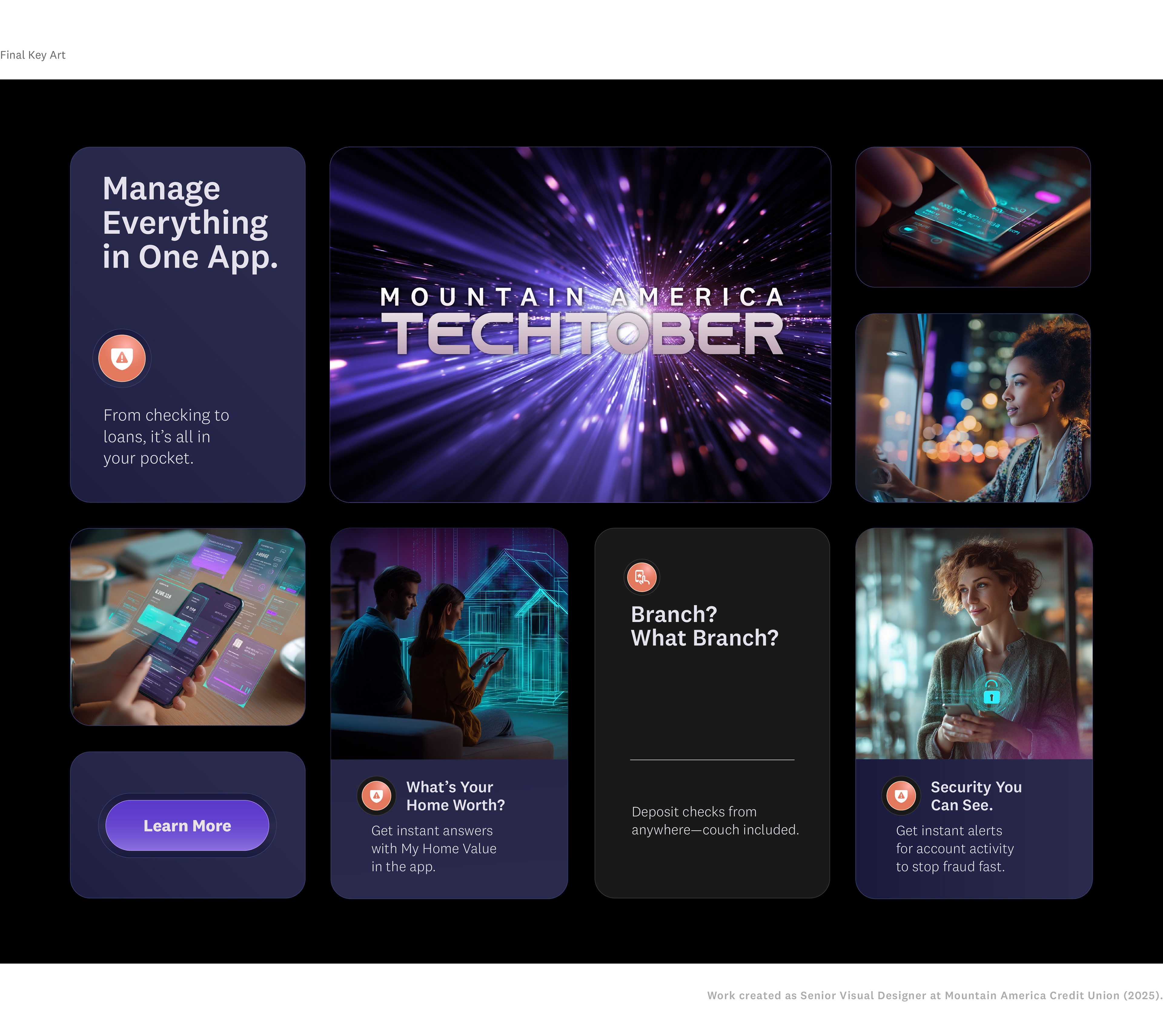
I developed a modular visual system that aligned with external brand standards while extending them for internal campaign use.
The system included:
• A flexible layout framework adaptable across formats and channels
• A unified color and UI-inspired component system
• Scalable assets for training materials, incentives, branch environments, and digital placements
This approach enabled consistent execution across teams while allowing for contextual flexibility depending on audience and use case.
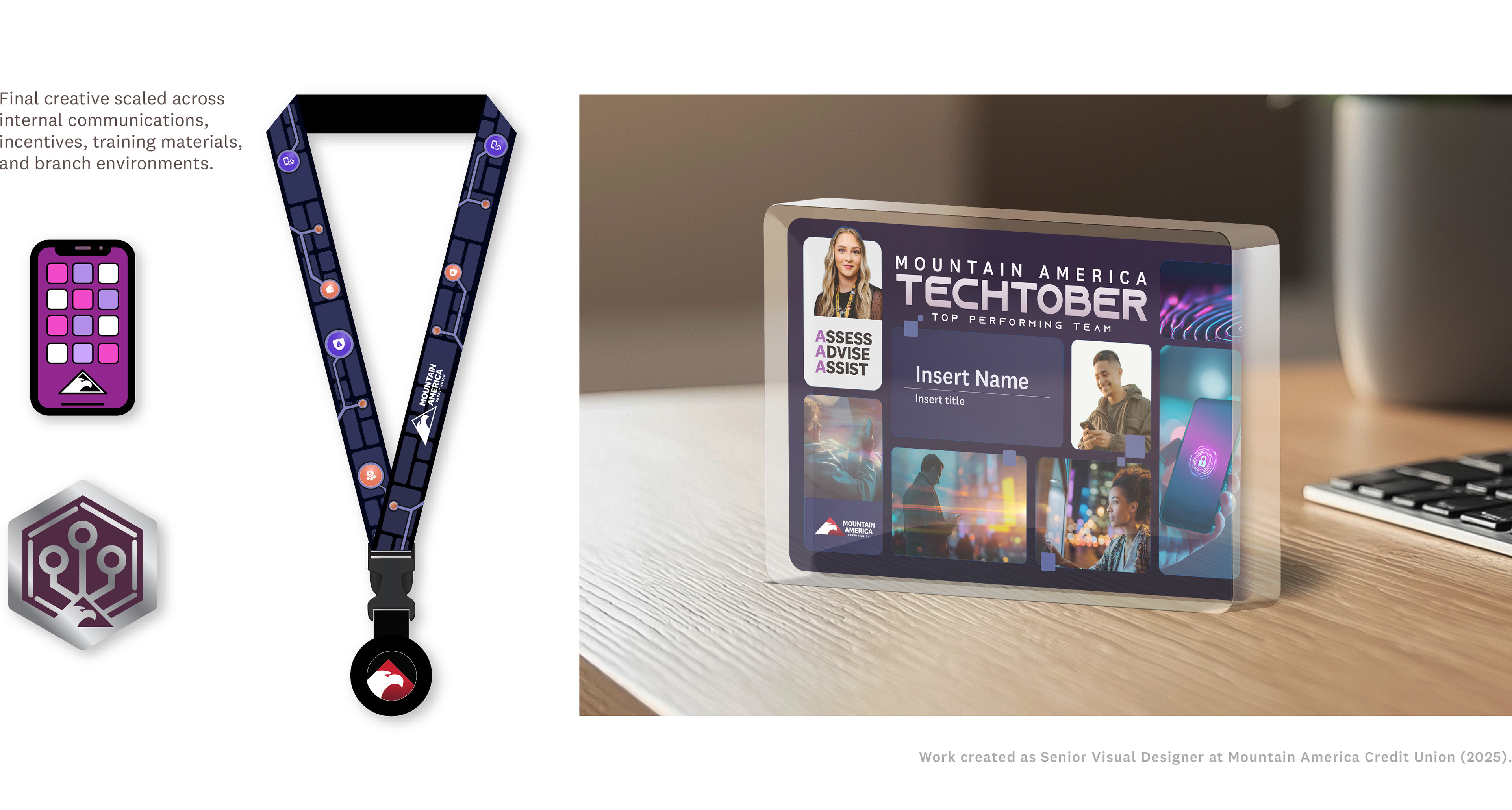
Execution
The final identity was deployed across:
• Internal communications and campaign messaging
• Gamification elements (pins, lanyards, incentives)
• Training materials and enablement tools
• Digital and promotional assets
This system supported a wide range of applications while maintaining visual consistency and brand alignment.
Impact
The campaign established a cohesive visual standard for internal initiatives, replacing previously fragmented approaches across teams.
• Enabled consistent execution across multiple departments
• Streamlined creative production through a scalable system
• Supported cross-functional adoption of campaign materials
This system supported a wide range of applications while maintaining visual consistency and brand alignment.
Reflection
Although my title was Senior Visual Designer, this project required operating at an Art Director level— owning creative strategy, navigating stakeholder alignment, and guiding execution across teams.
Balancing competing priorities reinforced the importance of designing systems over one-off solutions., ensuring the work could scale effectively across a complex organization.